Mercator’s World Map
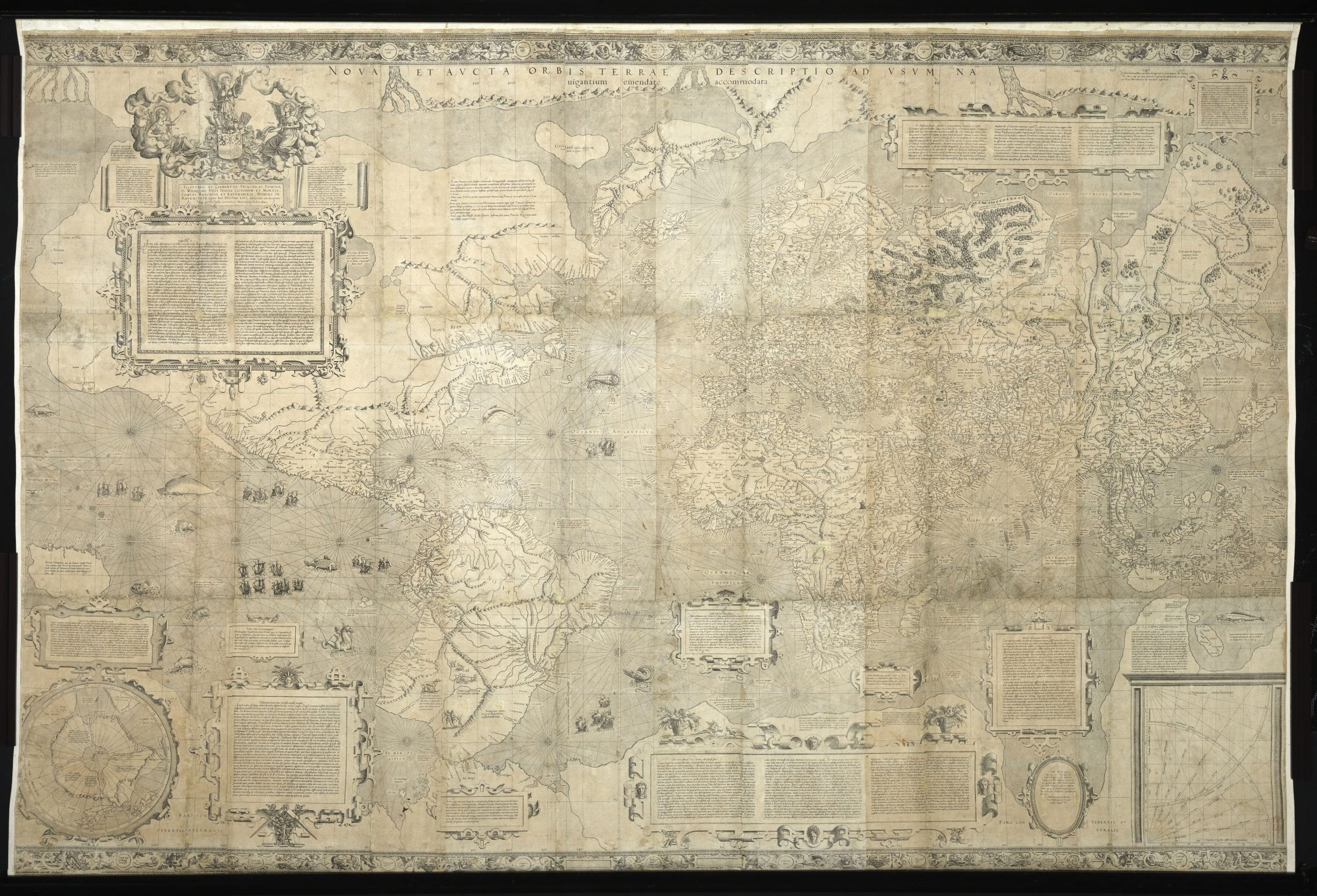
Gerard Mercator, Nova et aucta orbis terrae descriptio ad usum navigantium emendate accomodata, 1569. Bibliothèque nationale de France.
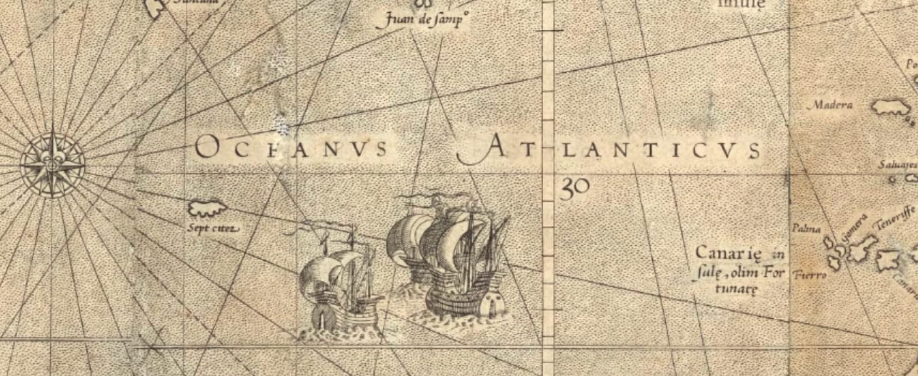
Gerard Mercator printed Nova et aucta orbis terrae descriptio ad usum navigantium emendate accomodata (New and Enlarged Description of the Earth with Corrections for Navigation) in 1569 from eighteen engraved copper plates. When the printed sheets are assembled, the map is huge, measuring approximately 125 × 203 centimeters (about 4 ft. x 6 1/2 ft). The label Oceanus Athlanticus appears at the center of the map, just to the west of the Canary Islands.
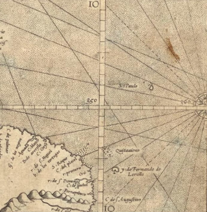
The map is characterized both by rhumb lines emanating from central points, as well as a grid of meridians and parallels. The rhumb lines are straight segments that make true angles with the meridians, which made it possible for navigators to chart a course at sea. The map contains a latitude scale and a longitude scale, each graduated in one-degree intervals, that intersect in the Atlantic, just north of Brazil, see below.
The lines of longitude (meridians) and latitudes (parallels) are perpendicular to each other, and they create rectangles visible on the map. These rectangles vary in size. The distance between the meridians is constant, but the distance between parallels increases towards the poles. This is the famous Mercator projection, see below, superimposed over NASA’s Blue Marble summer month composite). The Mercator Projection allows the calculation of courses at sea, but it greatly increases the size of lands at the north and south poles.
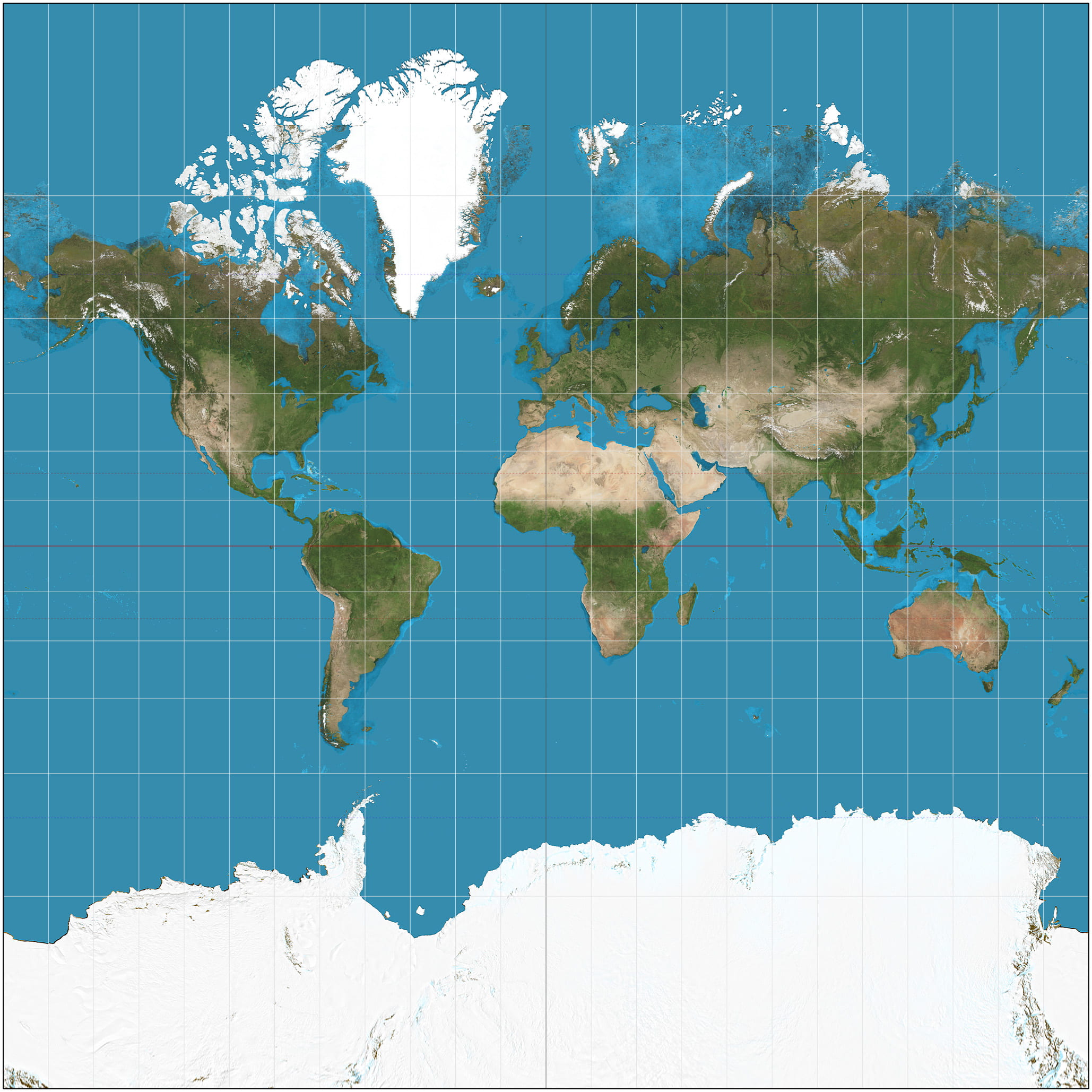
Daniel R. Strebe, The World on a Mercator Projection, 16 December 2011, Wikimedia Commons.
This view of the world created by the Mercator Projection dominated the presentation of the world on maps for centuries. The Atlantic Ocean occupies a privileged place in the center left of the map. The British Isles and northwestern Europe are enlarged relative to other continents, such as South America.
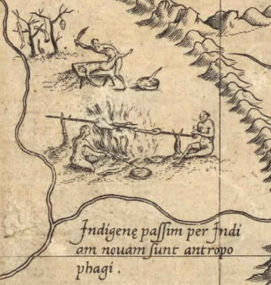
An illustration of cannibalism appears in the very south of South America on Mercator’s World Map. The legend below the scene states that the practice is customary throughout the “New Indies,” meaning the Americas. The legend reads: “Indigenae passim per Indiam novam sunt antropophagi” (The natives of various parts of the New Indies are cannibals). Despite the care that Mercator took with creating this world map, which was exceptional in many ways, he copied unquestioningly the cannibalism scene. The visual image, with its accompanying text, repeated and reinforced the claim that native peoples in the Americas were violent and inferior to Europeans. This damning stereotype would continue to shape negative perceptions of native peoples as Mercator’s map was studied and interpreted.